Friday 12 September 2014

TV Ads


Guide to an Analysis of an Advert

Choice of People – Have they chosen a celebrity or model to endorse their product?  Why?  What effect will this have on the audience?

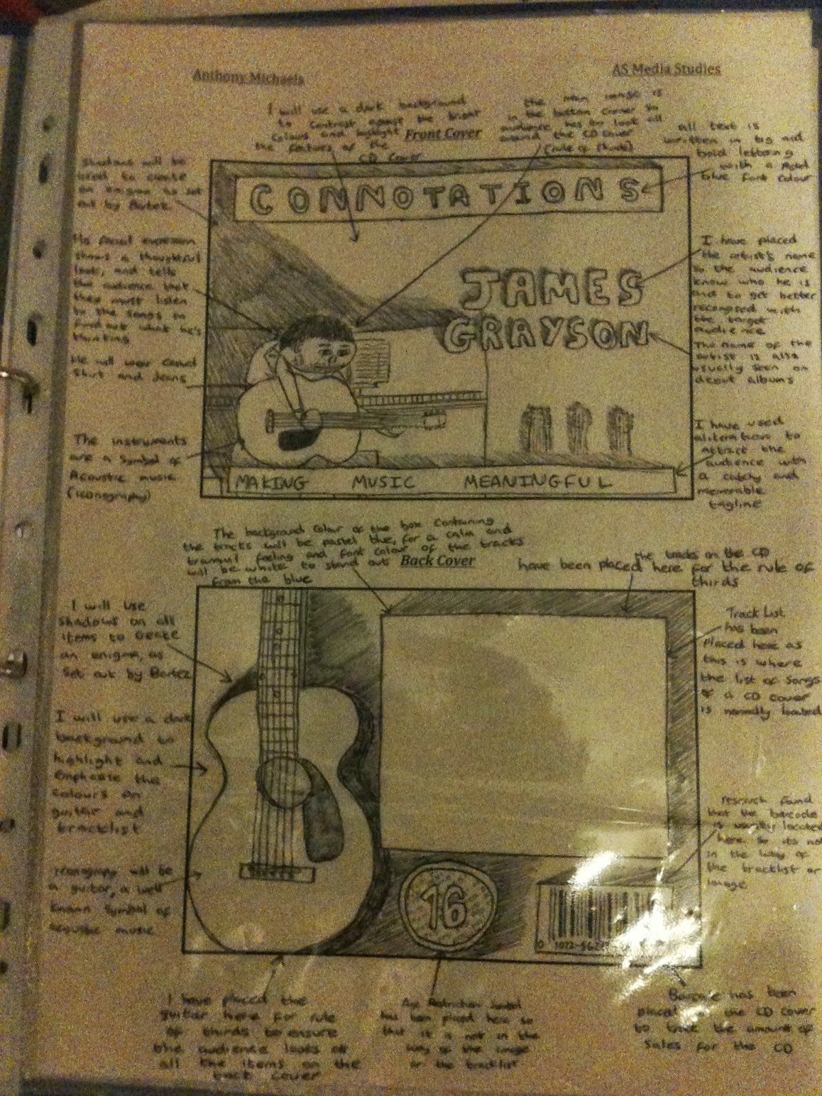
Facial Expressions – If there are people / animals / characters in the ad, what do their facial expressions suggest about the product?  Do they tell you how you would feel if you bought the product?

Body Language – What does their body language tell you about how you would feel if you bought the product?  Are they close together, far apart?  Do they look energetic or relaxed etc?

Colour –What colours have been used in the advert and what do they suggest about the product / brand?  Are the colours associated with any particular emotions or feelings?

Lighting – Where is the light and shadow in the picture?  What effect does this have on the audience?  Does it draw your eye to any particular points?  What effect does it have on the look of the product?  Is it subtle or dramatic?

Slogans / Wording – Is it catchy?  Is there alliteration? What words have they used and why?  What do the words tell you about the product?  Are they using puns, plays on words, metaphors and similes?  Why? Do the words suggest something about the product?  Have they used scientific words or statistics to make the product seem professional and effective?

Font – Why have they used a certain font?  What does it tell you about the product / bran / target audience?  Is it big and bold, or small and delicate?  Is anything in a different font and why?  What about the size of the letters?

Props / costumes – what do the props and costumes in the ad tell you?  Do they suggest something about the person who uses the product?  Do they tell you something about the way the product will make you feel if you use it?

Image Size – Have they used close ups, wide shots, medium shots?  Why?  Do they want you to see detail?  Or do they want to show you the whole picture?

Image Angle – Have they used an eye level shot?  A low angle shot (looking up at something) or a high angle shot (looking down at something)?  What effect does this have?

Product – How and why have they shown the product and its packaging?  What does the bottle / packaging / appearance of the product suggest about it?

Other images – what do any of the other images suggest to the audience?  Eg background images etc..

Product Name / Company Name – what do they suggest to the audience about the product or the institution?  Eg The brand name “L’Oreal Paris” suggests the product was made or associated with a capital city famous for fashion.  This signifies to the audience that the product is fashionable and chic.

KEY WORDS TO USE (tick them off as you go and use them as many times as you can)
Connotation / Denotation
Signify / Signifies
Target Audience
Visual Codes... Costume / Facial Expression / Colour / Body Language / Graphics
Technical Codes... Sound / Editing / Framing / Lighting
Represents (eg the image of diamonds represents the product as being quality)
Stereotypes...Challenge or Reinforce
Slogan
Brand Image
Shot Type...Close up / Extreme Close Up / Medium Shot / Wide Shot / Extreme Wide Shot
Low Angle / Eye Level / High Angle
Product
Packaging
Institution

ABOVE ALL
You should be writing about WHO the product is aimed at and how you know that.. and HOW it makes an audience WANT the product...

Task 1: Analyse the Coco Chanel advert using media terminology.
Orange books 300 word essay

Monday 8 September 2014

20 MS2 Coursework - Report

Learning objectives:
List five key points found from research that helped  to create artefacts as MS2 report is approached.

Approaching the MS2 Report

You will be shown how to approach your written report. This includes structuring using relevant terminology to demonstrate your own understanding.

Between 1200 and 1600 words
Your report should include:
A brief outline of the task.
A discussion of the most significant research findings which informed the pre production.
A brief justification of the target audience for the production.
An evaluation of the production which highlights its strengths and weaknesses through, for example, a comparison with existing media products.

Tips for writing a suitable report

The report must be 1200 - 1600 words and can be submitted in a range of different formats including; an essay or a suitably edited blog. The first part of the report outlines the research findings that informed your preproduction work and the second part of the report evaluates your production work.

The report is worth 40 marks so it is important that you spend some time ensuring what you write will pick up marks.

You must stay within the word limit and you should draft and redraft your report with Mr Ealey so that you achieve this

Use any notes you made when you were completing your preproduction artefact to help you to write the first part of the report.

Set out your aims clearly at the beginning of your report. This will ensure that your teacher and the moderator are clear about what you set out to do.

'My task was to create a storyboard, a DVD cover and two film posters for a gangster film. In order to accomplish this I had to engage in research of the gangster genre and the specific sub-genre of the gangster heist film.

Later in the report you can develop how you achieved your aims.

Briefly discuss the research undertaken and how it informed the pre production.
Include specific examples to back up your findings. For example, include references to specific films and and state what you discovered when you analysed them that informed your pre production.
Avoid statements like; ' I looked at a lot of magazine front covers...'
In other words, be specific and detail your findings.

Your aim is to demonstrate that your research enabled you to discover the key codes and conventions of your chosen genre which you then replicated in your work. If you are stuck then refer to the Media Studies blog and the examples that were set out during class.

Briefly discuss the intended audience for the pre production and production and explain how they have been targeted. Remember to justify your decisions

Evaluate the strengths and weaknesses of the production through, for example, a comparison with your production and existing media products.
Here you can include visuals, for example screen shots from your production and compare them to shots in a similar, existing text.

You will also need to complete a cover sheet. (See handout) outlining your preproduction and production. You will also need to briefly outline the focus of your report.

Task 1:
List in your orange books under the dated title ' Approaching MS2 report';
five key points found from your research that helped you to create your artefacts.


18 MS2 Coursework-Rough drafts

Learning objective: 
To rough out and annotate pre-production and production coursework with consideration given to the target audience.

Key words: Audience, visual codes, technical codes, mode of address, intertextuality.

You will be encouraged to consider the strengths, weaknesses and viability of your pre-productions before moving ahead with your pre-production work.

It is time to consider roughing out your pre production work.
You must know who your target audience is and how you are going to appeal to them through the use of generic codes and conventions.

Task 1: 
Rough out and annotate your ideas for pre-production coursework using the spider diagrams you have created to maintain focus on audience positioning.
Below is an example of a rough for a piece that scored highly.
You need to create something similar but this is not an art exam.


Task 2:
You will create a time management chart for the pre-production and production aspects of your coursework.


Work required for 30.1.15:

  • By close of business today you should have the following inside your folder:
  • Spider diagram of ideas for coursework.
  • Power point presentation showing examples of productions from within the genre you are dealing with.
  • Rough out on paper of your pre production plan. Annotated with comments on visual codes, narrative and any representation issues.
If these are complete you should create a time management chart which should include:

Dates set by you for completion of tasks.
  • Other people involved; actors, models, camera operators
  • Props required; costumes, hats, swords.
  • Make up, special effects.
  • Equipment required; SLR cameras, video cameras, memory cards, batteries, tripods, lights.
  • Software to use and time allocated for image manipulation.


17 MS2 Coursework Production (assessment HT3)

MS2 Coursework Production

Learning objective:


To continue with Coursework development for MS2 using examples from the genre.
Produce a Powerpoint presentation for assessment.

In preparation for your pre production and production coursework you should
1: Complete the spider diagrams
2: Create a Power Point Presentation which describes your intentions more clearly and uses examples of work that is in the same genre and either conforms to or challenges the codes and conventions for that genre.

Areas that must considered:
  • Iconography 
  • Mise en scene
  • Visual codes of costume, facial expression, colour, body language, graphics
  • Narrative structure
  • Technical codes of lighting, framing
  • Language used
  • Mode of address
  • Representational issues
  • Audience positioning
Use annotated images to show the work that you have explored in preparation

Print the power point presentations out two to a page and submit with your spider diagrams period six today.

Year 12 written tasks success criteria:
Knowledge of the concept of audience/representation/narrative
Awareness of relevant theories/debates/views
Uses examples to draw on relevant issues
Use of media terminology/key words
Quality of written communication


18 MS2 Coursework Production Magazine covers (assessment HT3)

MS2 Coursework Production

You will be guided in the codes and conventions of Magazine covers
(assessment HT2)

Key words: Encode, decode, polysemic.

17 MS2 Coursework Production - More exemplar

MS2 Coursework Production

You will continue to produce Coursework for MS2 and receive feedback

Key words: POV. Positioning. Preferred, negotiated, oppositional reading.

17 MS2 Coursework Production-Magazines double page spreads

MS2 Coursework Production

Learning objective:
You will be guided in pre production techniques of creating a double page spread for a magazine and asked to annotate the conventions of a correctly formatted example.

Key words: 
Image, quote, 11pt, Ariel, drop cap, columns, Mode of address, by-lines, colour scheme.


Task 1: 
Annotate two of the following magazine DPS's. 
Indicate the conventions used and comment on the mode of address in use.


Year 12 written tasks success criteria:
Knowledge of the concept of audience/representation/narrative
Awareness of relevant theories/debates/views
Uses examples to draw on relevant issues
Use of media terminology/key words
Quality of written communication

Peer Assessment.

Use the handouts provided to assess the work of your peer.
Award 20 marks for each of the success criteria indicated above giving a final total out of 100.
The assessment focus for this task is: DVD cover - codes and conventions

A*   91 - 100
A     81 - 90
B     71 - 80
C     61 - 70
D     51 - 60
E     41 - 50

Related link: Layout disasters

17 MS2 Coursework Colour

Learning Objective: To apply colour theory to texts

Key words: Connotations, symbolism


Color surrounds us everyday of our lives.
Each color conveys a feeling.
The psychology of color evaluates what each color portrays.

---------------------------------------------------------------------

It's suggested that the color red creates the feeling of excitement, strength, sex, passion, speed, and danger.

RED

-------------------------------------------------------------------------------------
While green gives more of a relaxing feeling.  Green is also suggestive of nature and freshness. The colour of new beginnings.
Symbolizes nature, calming, refreshing, growth, harmony, fertility, safety, healing, and freedom. 
Green is easy on the eyes and non-invasive. 
Darker hues of green tend to be more masculine and conservative. Dark greens are often linked to the financial world (wall street, wealth, money). Lighter hues of green (aqua, olive) are good for healing or peaceful purposes.

GREEN

------------------------------------------------------------------------------------------

Blue suggests trust, security, reliability, belonging, and coolness.
The police are known as the boys in blue.
Holds mostly positive connotations: peaceful, calming, tranquility, loyalty, nature (sky, ocean), depth, stability, trust, loyalty, wisdom, confidence, spiritual, productivity, cleansing, and health. On the flip side, blue can also be representative of cold and depression.
Blue is considered a masculine color, and is more commonly preferred by men over women. It’s a good color to wear to job interviews and a wise choice for promoting high tech products, as it suggests precision and strength. Tests have shown that people in blue colored rooms tend to be more productive. Weight lifters have also been shown to be able to lift greater amounts of weight in blue colored gyms.
It’s advised to not use blue in association with anything food or cooking related, as it suppresses the appetite. Blue, when combined with warm colors like yellow or red, can create high impact and vibrant designs. Blue is often considered to be the safest global color.
Darker blues tend to more represent depth, expertise, stability, power, seriousness, and integrity. Dark blue is commonly used in the corporate world. 
Lighter hues of blue are often used for anything relating to healing, tranquility, Freshness and softness.

BLUE

------------------------------------------------------------------------------------------------
Violet is the color of dignity, spirituality, wealth, royalty, and magic.

Combines the stability of blue and the energy of red. 
Terms associated with purple include: royalty, ambition, wealth, sophistication, femininity, creativity, mystery, nobility, magic, independence, and romance. Because purple appears little in nature, it can often appear artificial. Because of this; it’s advisable to not use purple in designs trying to portray a sense of “natural”.
According to surveys, about 75% of pre-adolescent children prefer purple to all other colors. 
Lighter colored purples tend to evoke romantic and nostalgic feelings while darker purples more commonly convey gloom, sad feelings, and frustration.
PURPLE

----------------------------------------------------------------------------------------------


Black can suggest hate in some cases, but on the other hand it can suggest sophistication, elegance, seductiveness, and mystery.
Black is used commonly to advertise luxury cars.  This has to deal with the fact that black symbolizes authority, sophistication and power.  So someone who wants to feel in control of their car and important would probably lean towards a black car.
It is a formal colour, worn to black tie dinners.


 The black leather jacket is a symbol of rebellion.


BLACK

------------------------------------------------------------------------------------------------------------------------------------------------
The opposite of black is white which is considered pure, virginal, clean, and youthful.
The feeling can also coincide with light and hope.

Innocence, purity, goodness, cleanliness, perfection, safety, positive, faith, cleanliness, cold, virginity, safety. A wise color choice for use with charitable organizations, hospitals, and anything trying to show safety or purity. A neutral colour.

WHITE


--------------------------------------------------------------------------------------------------------------------------------
Yellow, a color that obviously suggests the sunshine and the warmth the sun provides.  It's also a very happy color that conveys hope.
The exciting colour of health and happiness.

YELLOW

------------------------------------------------------------------------------------------------------------------------
Another bright color is orange which is a very playful, warm and vibrant color.  
It is a dynamic cross between red and yellow, the colour of movement.
Estate agents use orange as ado parcel delivery companies.
Also a healthy colour like... er oranges!

ORANGE
--------------------------------------------------------------------------------------

All these colors and more are used in marketing and media because of all the different feelings they are able to convey. 

Task 1:  List colour symbolism in your books.

Colour symbolism summary

Red – importance – passion – love - danger

 Orange – health – movement -dynamism

 Yellow – warmth – permanence - jealousy

 Green – freshness – beginning- youth– newness - envy

 Blue – cool – sad - authority-trust

 Purple – wealth - luxury - power

 Black – evil – formality - mourning - simplicity - sophistication

 White – innocence – purity – formality - sophistication

 Neutral – urban - sophistication


Task 2:
Webdramas are short films that have to use cliches and many devices such as colour symbolism to attract a loyal audience.

Watch this episode of the webdrama Anyone but Me and note down the connotations of the colours that are used in the mise en scene.


Task 3:
Create a series of mood boards using Adobe Photoshop to show how colours have connotations.
  • Red
  • Yellow
  • Blue
  • Green
  • Purple
  • Orange
Below is an example of a mood board.


Flatten each image and save as a jpg which will be included in a Power Point presentation.
E-mail this to Mr Ealey when complete.

_______________________________________________________________________


Restaurants, car dealerships, clothing stores, commercials, television programs, etc. use color to convey a feeling to address to their audience.

Fast food restaurants are famous for using their bright colors to bring in the customers and get rid of them fast. That's why it's called fast food. There are also restaurants that use colors that are more welcoming that make you want to sit down and relax with friends and family. 
 These are generally the more expensive restaurants. 

Although color is crucial when it comes to marketing.  There are still things you must look out for.  One in particular is your audience.  Colors have different meanings in other cultures.  
For example, in the U.S white is a color of purity.  This is why brides usually wearwhite, because it's a virginal symbol.  Now on the other hand white is the color of death in China.  
Now in the U.S black is known for symbolizing death.  This is why almost everyone wears black to a funeral.  
 The color purple symbolizes death in Brazil.  Where as in the U.S it's more a color of dignity, royalty and spirituality.
Yellow symbolizes warmth and sunshine in the U.S.  Yet, in France it symbolizes jealousy and in Greece it symbolizes sadness.
In the U.S we associate green with the color of jealousy because it's the color of money.  
Since there are all of these variations of meanings behind colors you must use the right method to target your audience.  Also you can't always generalize what colors mean to people. This is because sometimes people look at color differently.  It can symbolize different things because of someone's experience with it.
All in all color is crucial when it comes to marketing. You must target your specific audience and decide what color means to them.   


http://www.sibagraphics.com/colour.php

16 MS2 Coursework storyboarding

MS2 Coursework  Pre Production

You will be guided in pre production techniques of storyboarding
And asked to describe the conventions of correctly formatted Pre pro documents.
Key words: Plot. Continuity.

16 MS2 Coursework CD covers

MS2 Coursework  Pre Production

You will be guided in the codes and conventions of CD covers

Learning Objective: 


Learning objective: To deconstruct the codes and conventions of CD covers

Key words: Genre, target audience, conventions, fonts.


Textual analysis:
‘Investigate how genre conventions are used in the CD cover ROCKFERRY by Duffy’

This is for analysis of :

The CD cover contains many recognized codes and conventions.

Main image
A large black and white image of the star Duffy dominates the text set against an out of focus background which includes the carriages of an old fashioned train. 
The photograph has been taken with a shallow depth of field. The image is typical of the soul genre of the Sixties and has connotations of that iconic period in popular music which includes the promotional images of The Beatles and models photographed by David Bailey. 

Duffy looks as though she doesn't want to let go of her youth, is she afraid of the journey she is about to take possibly to adulthood which would be identified with by a teenage audience.

The cover reminds us of the sixties British white soul singer Dusty Springfield: (Fig 2).


(Fig 2)

Duffy is looking down and looks a little sad about the journey she is about to take.
The photo is taken at eye level and is a naturally lit mid-shot taken in a realistic setting.
We can see from Duffy's body language, holding on to her coat that she may be apprehensive.

The symbolic codes of dress which include a bold black and white coat and bleached blonde hair. Again this reminds us of the Sixties and iconic singers like Dusty Springfield who is reknowned as one of the greatest white, British, female soul genre singers. Duffy's style of singing has been called Blue eyed soul.

The presence of the train could suggest the star is about to take a journey. Rockferry is a small working class town on the Wirral and a well known narrative of 'rags to riches' is being constructed. 
There are connotations of the English North /South divide which exists today as it did in the Sixties when the Beatles traveled from Liverpool to London in the film A Hard Days Night.

Graphics:
The title of the album is in capitals and the serif font STENCIL has been used.
Stencils are used by rail companies to identify their cargo, so the lettering has connotations of train travel.
Above the main image is the signature of the artist. It can be described as feminine This will appeal to the target audience who may feel they are buying something unique or collectible, like the autograph of Duffy the celebrity personalising the CD for fans.

In conclusion, the codes and conventions used on the CD are typical of the British soul genre which was reborn through artists like Duffy in the mid noughties.
________________________________________________________________

Task1:
Rewrite the codes and conventions of CD covers into your Orange books.

Task 2:
Using the template provided, design a cover for a new CD promoting a new band to an audience of young people aged 15 - 25. You must invent the name of the band with the target audience in mind.


Year 12 written tasks success criteria:
Knowledge of the concept of audience/representation/narrative
Awareness of relevant theories/debates/views
Uses examples to draw on relevant issues
Use of media terminology/key words
Quality of written communication

Peer Assessment.

Use the handouts provided to assess the work of your peer.
Award 20 marks for each of the success criteria indicated above giving a final total out of 100.
The assessment focus for this task is: CD cover - codes and conventions

16 MS2 Coursework DVD covers (assessment HT3)


You will be guided in the codes and conventions of  DVD covers

(assessment HT1)


Learning Objective: 
To apply the conventions of DVD covers to a mock up DVD cover of the sequel to a film you are familiar with.

Key words: 
Main title, main image, hierarchy, spine, cast, age certificate, blurb, synopsis, reviews, awards, running time, institutional logo, lettering, action line, handwritten.

Dvd covers that you produce as a part of your coursework will need to have the following elements included, they will need to be designed to appeal to the specific target audience that you have in mind:

Task 1: List the conventions of Dvd covers in your orange books.

  • Main title - written using a font that is suitable for the genre and the audience of that genre. 
  • Main image - consider all the visual and technical codes when putting this into place. It should reflect the content of the Dvd.


  • Tagline – draws the audience’s attention sometimes by asking them a question.
  • Iconography – relevant to the genre or images of famous actors, or even places – because the  audience may recognise them from other films they are familiar with.


  • Industry reviews – gives the film critical acclaim, often accompanied by stars out of five.
  • Sequel – audiences may have seen the first one and will find a sequel appealing.
  • Blurb or synopsis on the back of the DVD cover – wording is sensationalised mentioning actors' names and giving information about the narrative.  Sometimes asking asks questions to the audience to create enigmas making them want to find out more.
  • Bonus features – the audience is getting inside information about the film, the actors, crew. Gives the text a personal feel.
  • Awards – gives the film recognition to the audience. Audiences want to watch successful films.
  • The production company – audiences recognise them from previous films and give them an indication of the style of the film.
  • Director – audiences might recognise the name from other films they have made.
  • Film classification – necessary organisational issue.
  • Screen grabs – gives the audience an insight into the film.


  • Task 2:
    List the conventions evident on this annotated DVD cover (Wizards). Ignore the typos. Orange books.

    Task 2: Take notes from this DVD cover presentation. Orange books.

    Assessment. Task 3: 
    Using the template provided, design a mock up of a DVD cover for the sequel to a film you are familiar with. Choose a genre that has iconography you are familiar with. Make notes on the back of the handout rather than annotating your design.
    This is not an Art exam so just indicate any colours along with the connotations for that colour.


    Year 12 written tasks success criteria:
    Knowledge of the concept of audience/representation/narrative
    Awareness of relevant theories/debates/views
    Uses examples to draw on relevant issues
    Use of media terminology/key words
    Quality of written communication

    Peer Assessment.

    Use the handouts provided to assess the work of your peer.
    Award 20 marks for each of the success criteria indicated above giving a final total out of 100.
    The assessment focus for this task is: DVD cover - codes and conventions

    A*   91 - 100
    A     81 - 90
    B     71 - 80
    C     61 - 70
    D     51 - 60
    E     41 - 50


    15 Approach to MS2 Coursework - Exemplar work

    Learning objectives: 
    You will analyse a range of MS2 exemplar work and familiarise with the marking criteria.

    Key words: Pre production. production, report.

    When analysing print based media texts there are conventions to assess:
    • Visual codes: Colour use. Iconography. 
    • Mode of address, is it appropriate for the target audience?
    • Language: Hyperbole, direct quotation, subject specific lexis, direct quotations.
    • Technical ability: Photography skills, camera shots and angles, composition, rule of thirds for example. Lighting suitability.
    • Layout and design: Font style. Masthead, cover lines.
    • Conventions: Bar codes, social media links, price.
    Task 1: 
    Study this example of print based work and discuss in pairs how the submission should be graded.
    Candidate B:

    Candidate B: Pre-production - DVD cover


    Candidate B: Production - 3 Posters


    Candidate B: Report


    Task 2: 
    Individually grade this submission using the handouts provided.

    Candidate C:
    Pre-production; 2 Posters


    Candidate C:
    Production; 2 DVD covers


    Candidate C:
    Report


    Task 3: 
    Discuss in pairs what you would like to produce for your coursework and for homework complete the form in 
    Student share/Media/AS_Coursework Spec and forms.doc

    providing information about your proposal.